When Scandinavians renovate, they often aim to emphasize a retro vibe. They preserve the parquet flooring and restore old furniture. They select new tiles and wallpapers to give the impression that nothing has changed in the apartment for decades. Only a keen Scandinavian design enthusiast can spot items from IKEA or Marimekko.
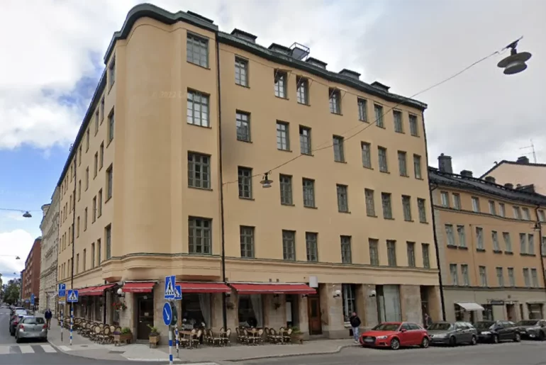
Today, I’ll show you such an apartment. It’s located in a typical three-story building on the outskirts of Stockholm. At first glance, the building looks very plain. Three floors, a light beige facade. No terraces or flower pots on the window sills. It seems like the apartments here are just as unremarkable. But between expectation and reality lies a gap.
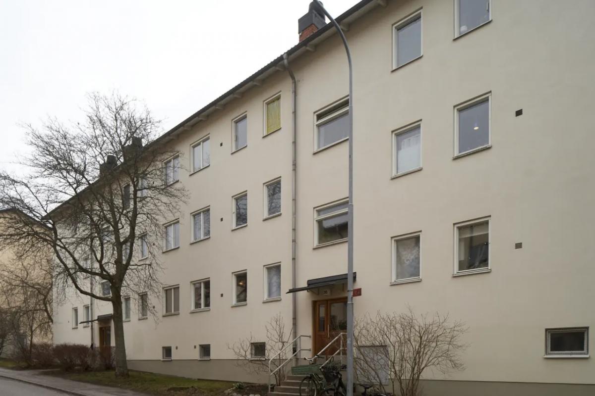
This is what the building looks like, one of the apartments of which we’ll peek into today (it’s on the top floor).
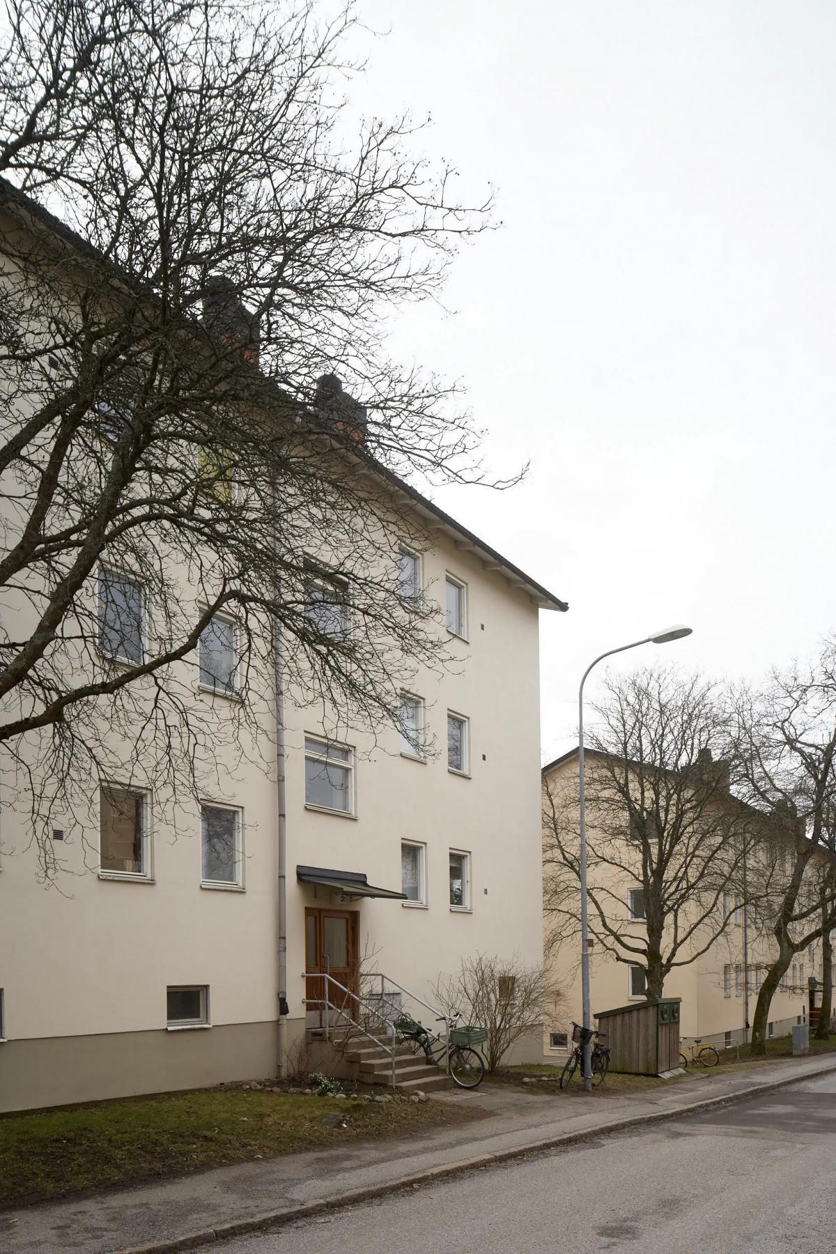
Most of the neighborhood is filled with similar three-story buildings. These houses are almost 80 years old (built in the 1940s).
The apartment’s area is 53 square meters. The positives include windows on three sides, high ceilings, a balcony, as well as a laundry room and a storage room for bicycles in the basement.
The apartment has been home to three generations of the same family. They’ve preserved many original details: windows, parquet flooring, kitchen cabinets, and much more.
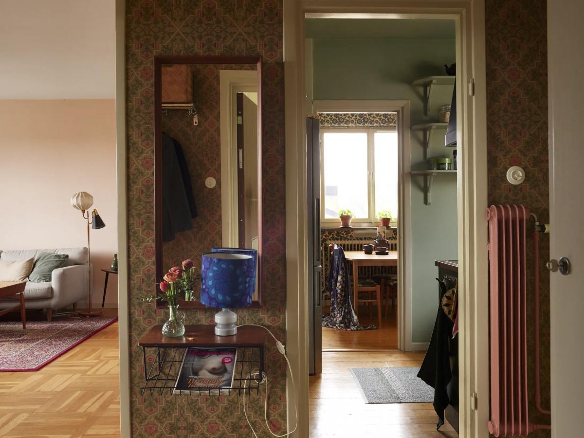
Initially, the apartment had two rooms, but part of the kitchen was separated to create an additional room.
This is how the apartment’s layout looks now:
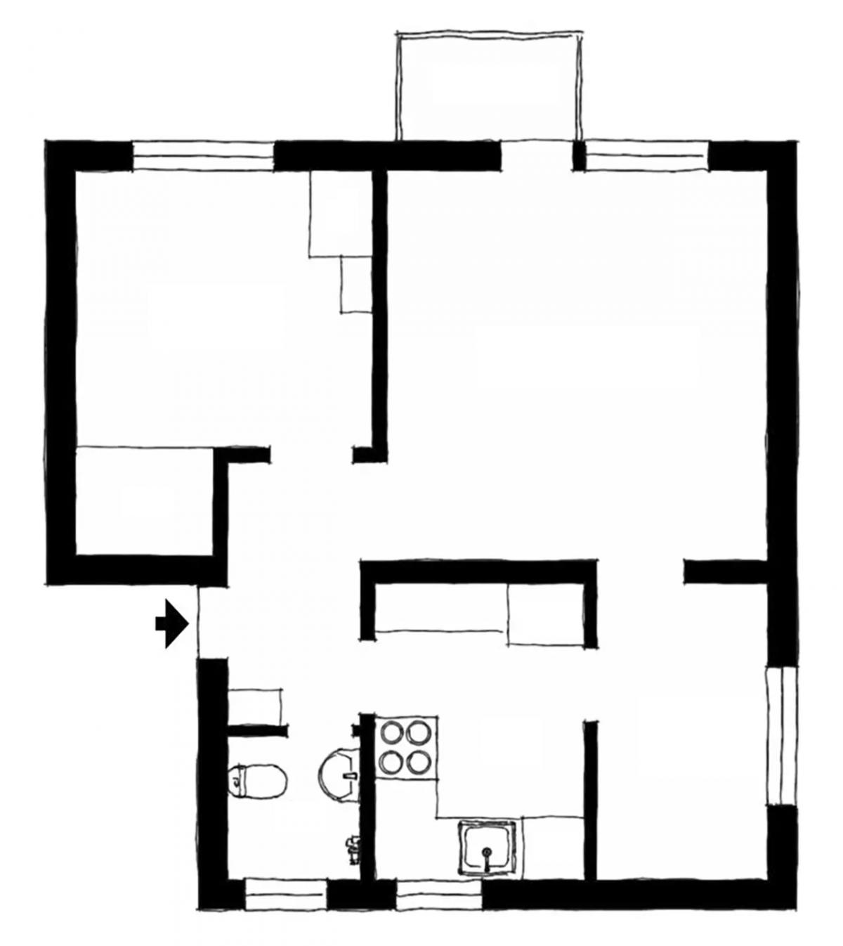
Once upon a time, the extra room was a children’s room. Now it’s a mini-dining room.
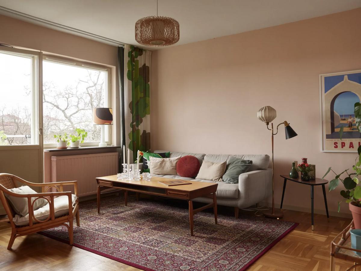
Let’s start with the living room. Original parquet flooring and windows. A 1950s armchair, rug, and floor lamp from the Swedish firm Borens have been here since grandma’s time.
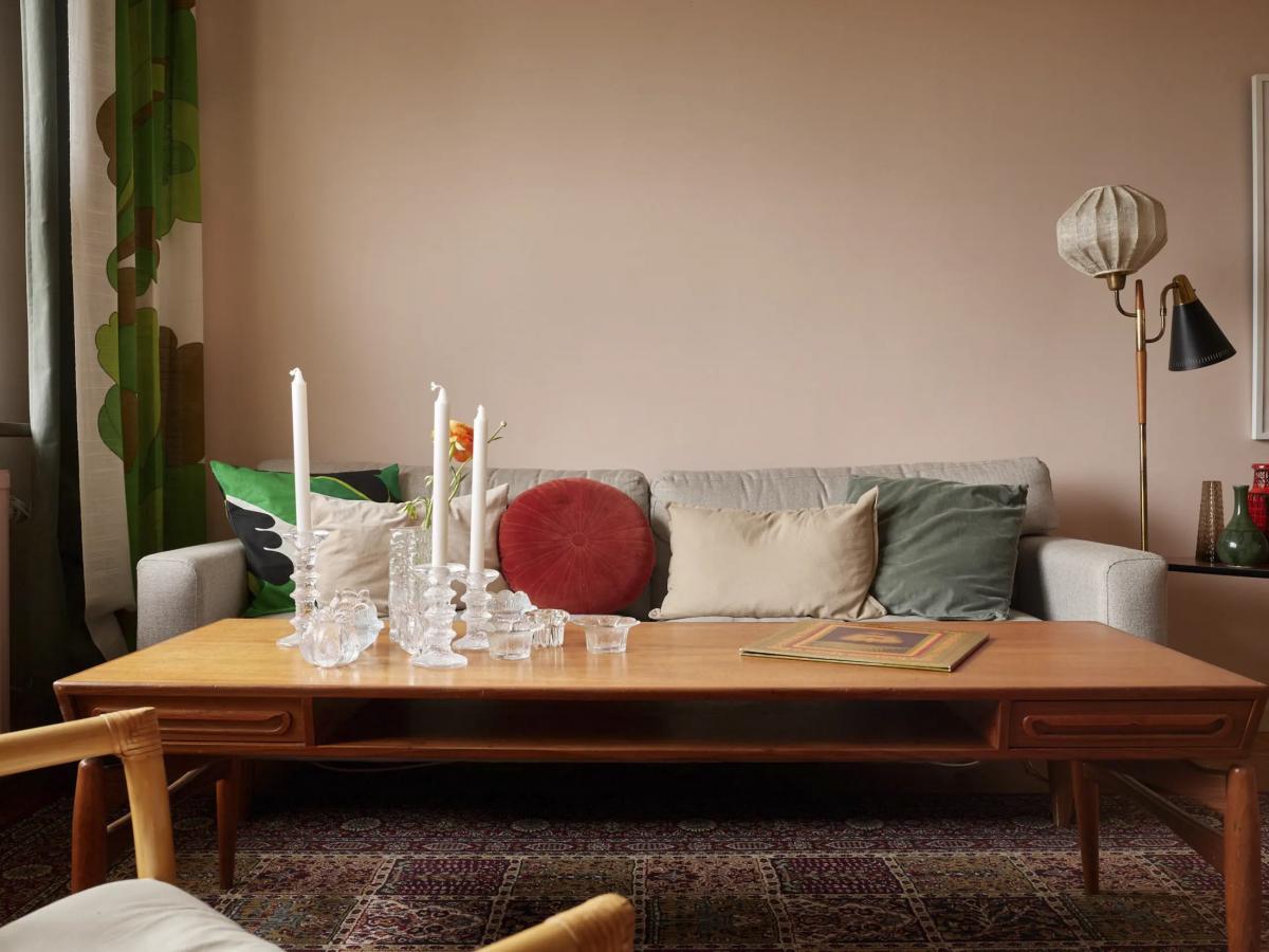
The dusty pink color for the walls is chosen remarkably well: imagine how bleak the furniture would look against white walls.
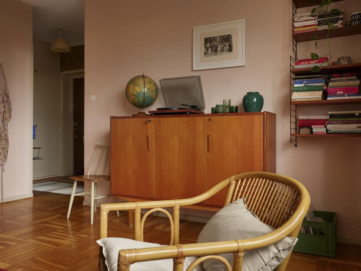
Nothing extravagant. The atmosphere is set by a retro dresser, an old globe, a record player, a green crate of records, and popular shelves with metal frames.
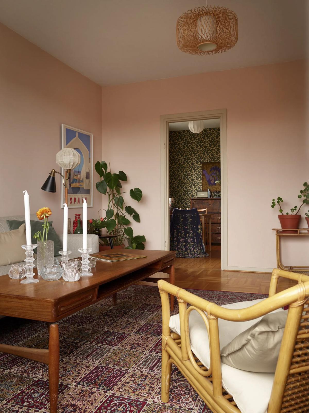
Very often, such rugs can be found in Swedish homes.
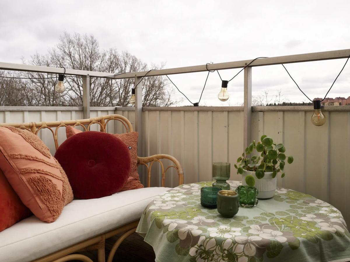
The balcony is small but cozy. A nice spot to sit in the morning with a freshly brewed cup of coffee. A string of lights, a garden bench made of rattan, a couple of cushions, and a table with a fancy tablecloth – without them, it would be much duller here.
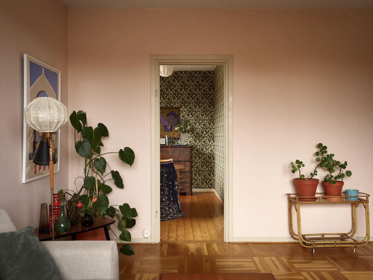
From the living room, you can enter the dining room. And from there – to the kitchen.
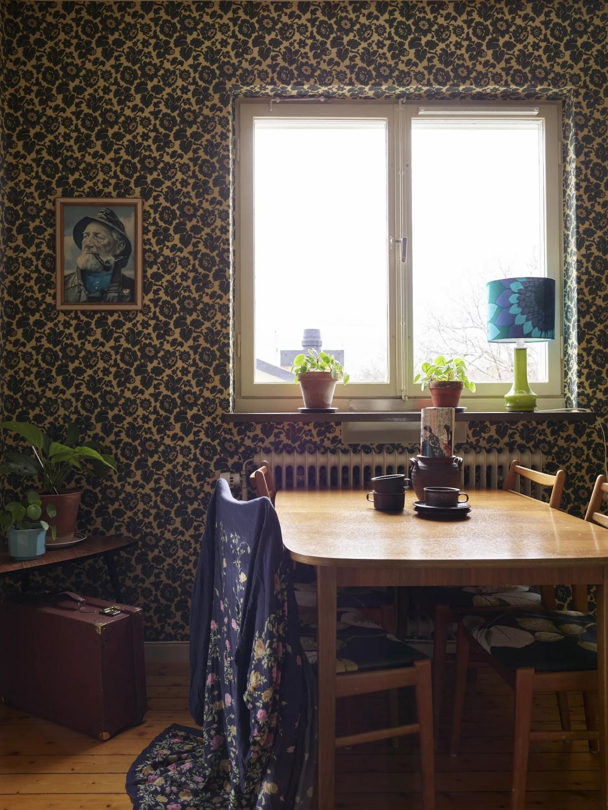
The gloomy wallpaper seems to be from the 1950s-1960s. In reality, they are relatively new. It’s the Lim & Handtryck brand, and the print is called “Theorins konditori” based on a 19th-century pattern.
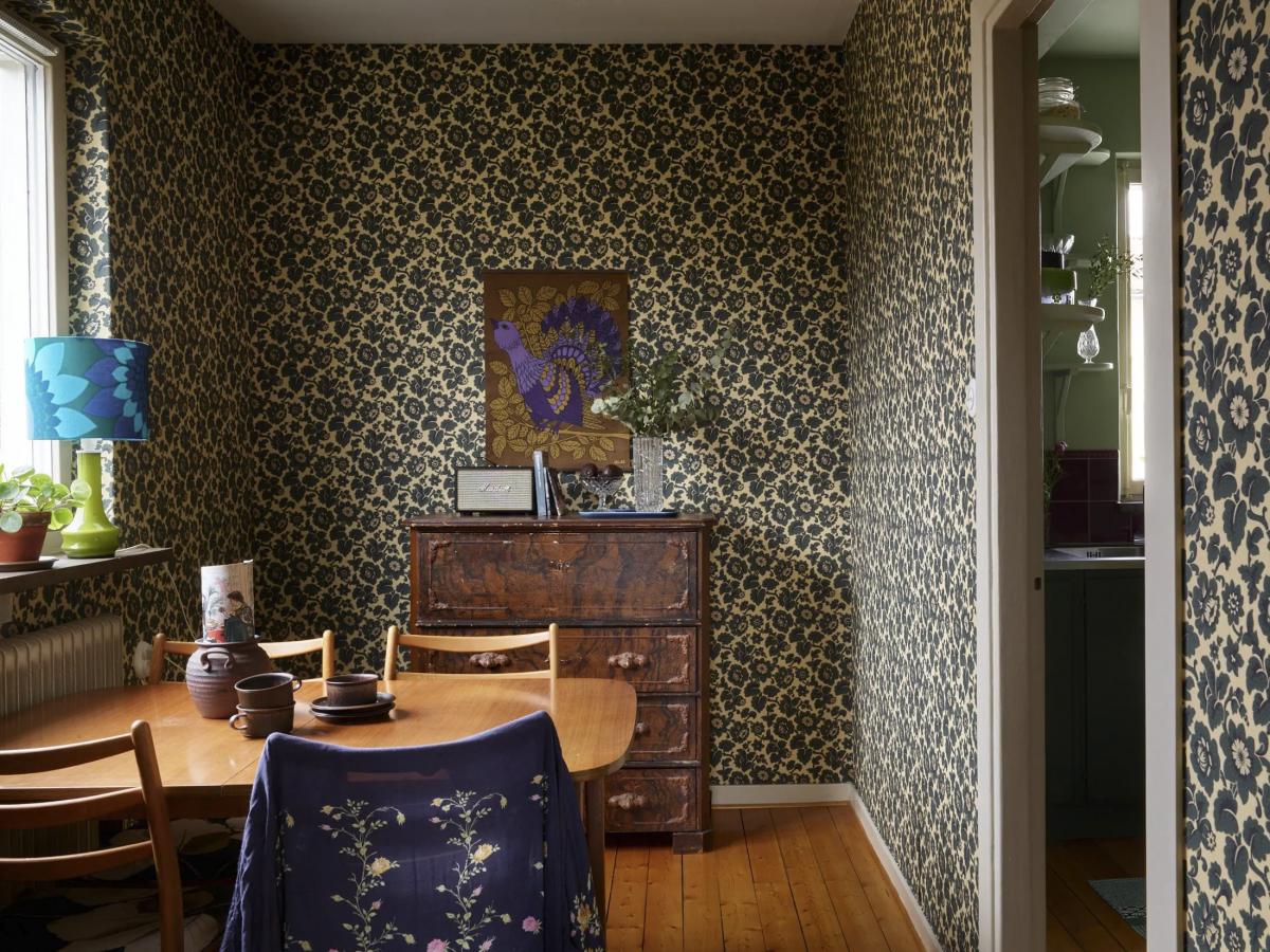
I’d move the dining table to the living room (there’s plenty of space there), and here I’d set up a home office or a library.
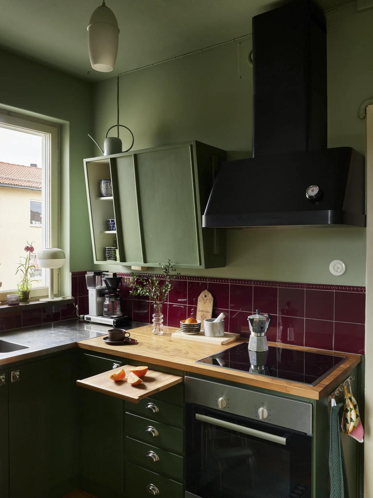
Due to the redesign, the kitchen turned out to be very small.
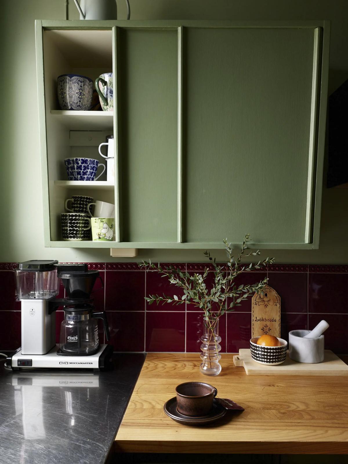
The main highlight of this kitchen is the original kitchen cabinets, which have been here since the house was built.
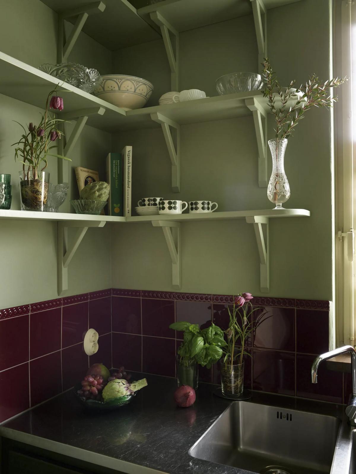
The burgundy tiles are already modern (from the Byggfabriken), but again, it’s a stylization of the 1920s.
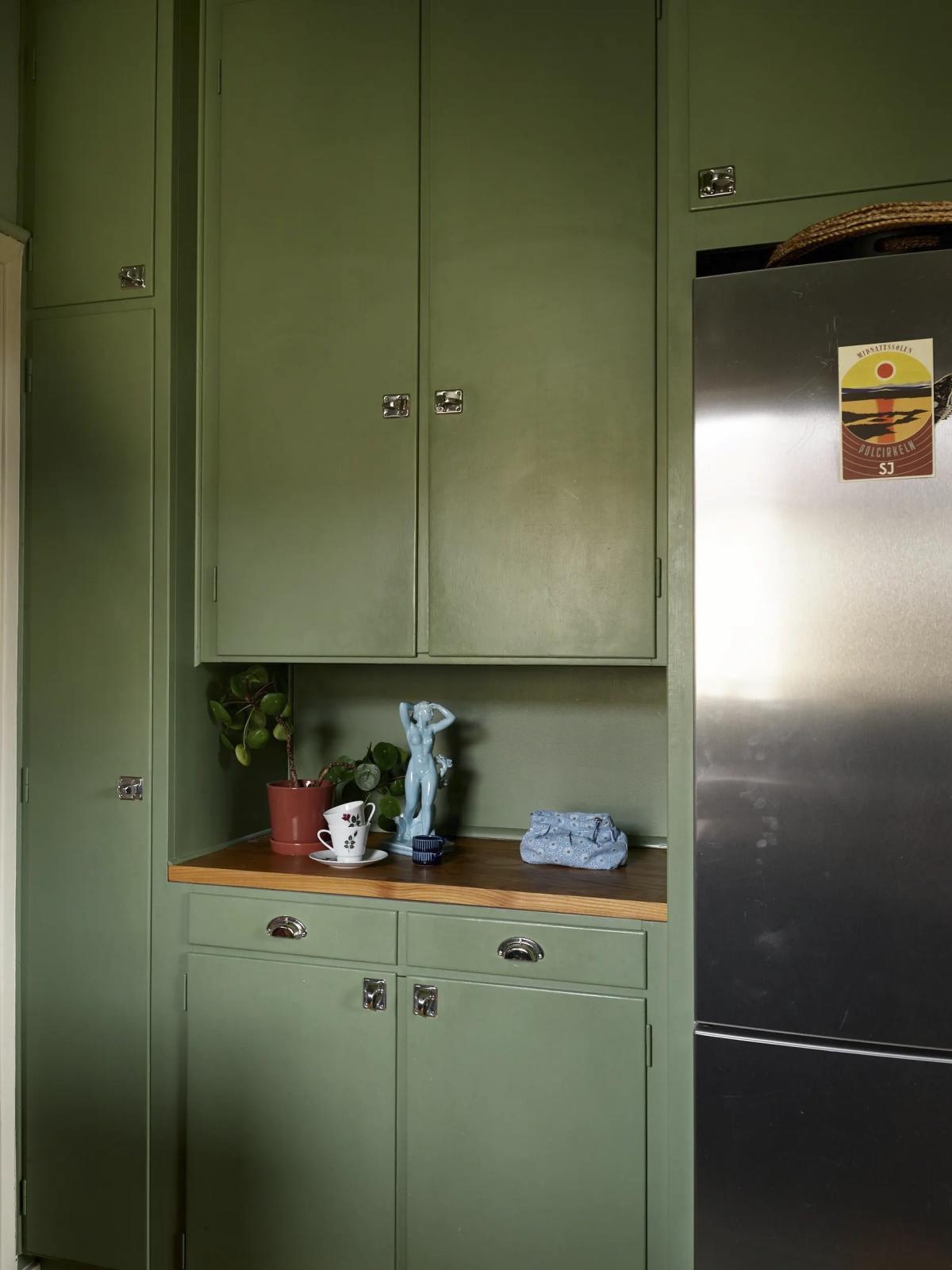
The cabinets, though original, have been repainted many times. Originally, they were white.
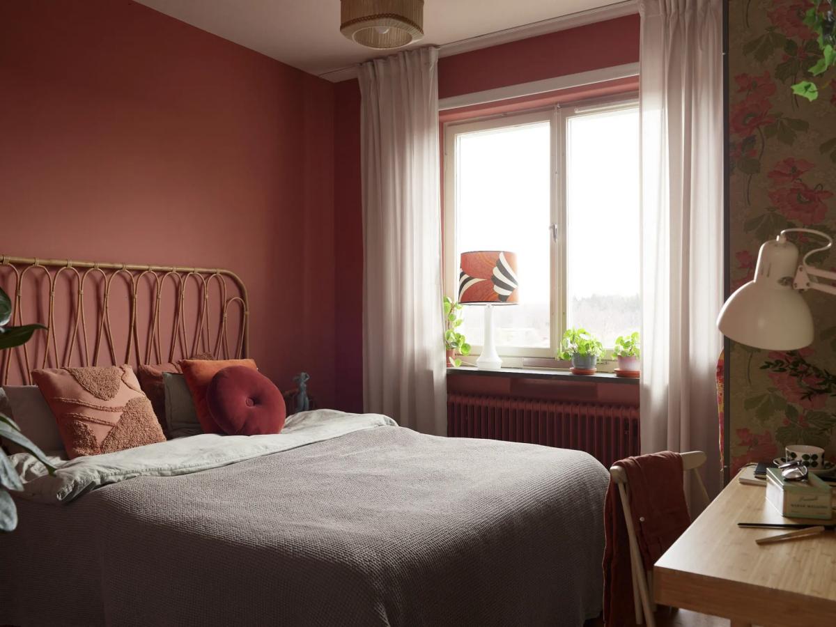
And this is how the bedroom looks.
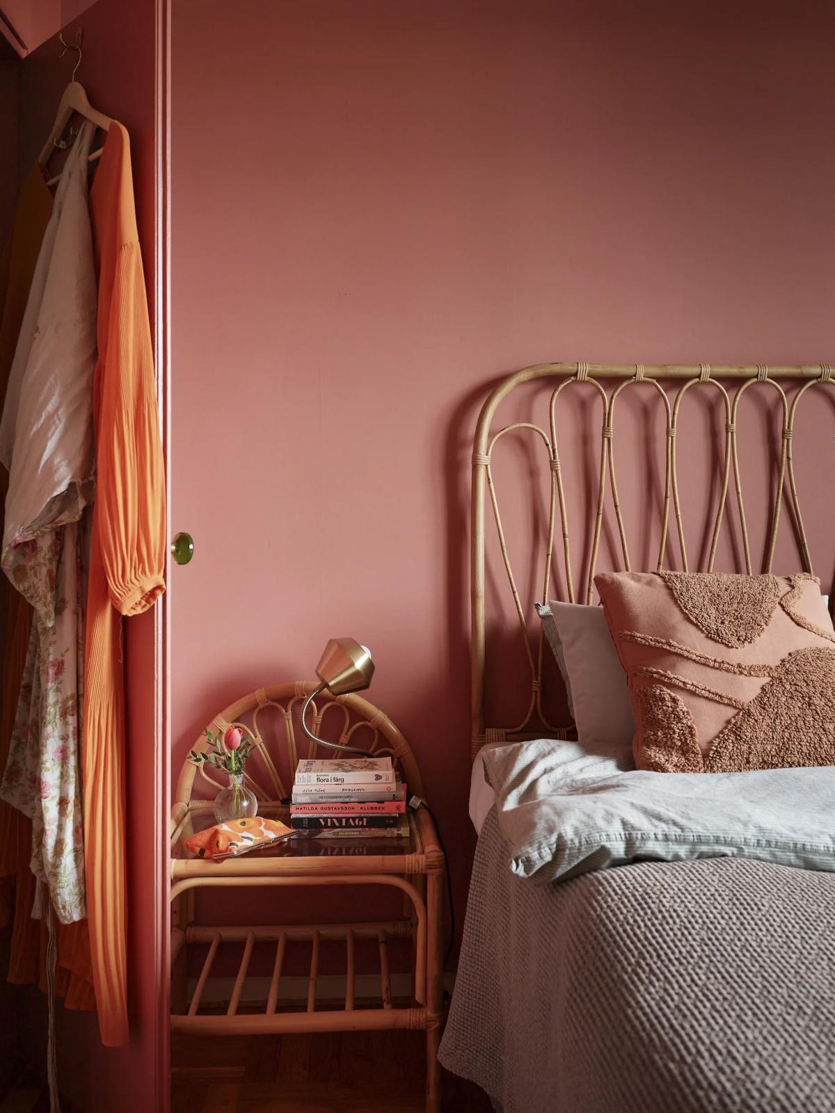
The bed headboard and bedside table are made of rattan in a unified style.
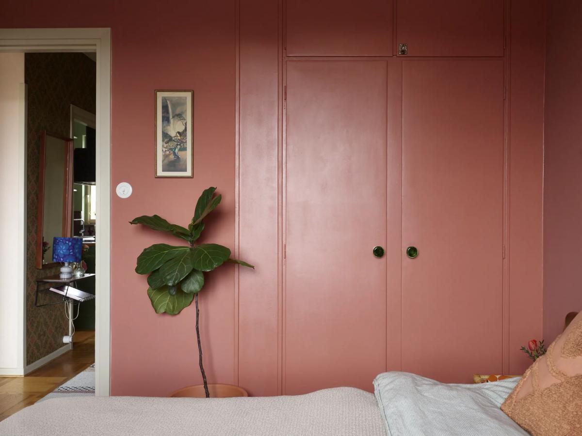
Behind these doors hides a spacious walk-in closet (take a look at how it looks on the floor plan I showed a little earlier).
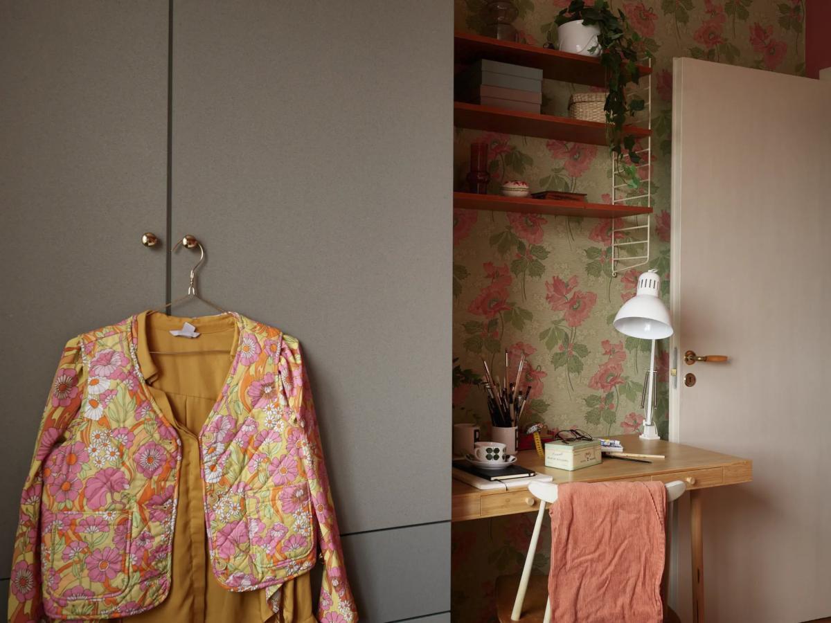
Opposite the bed, there’s another wardrobe and a modest workspace. The wallpaper is from Lim & Handtryck.
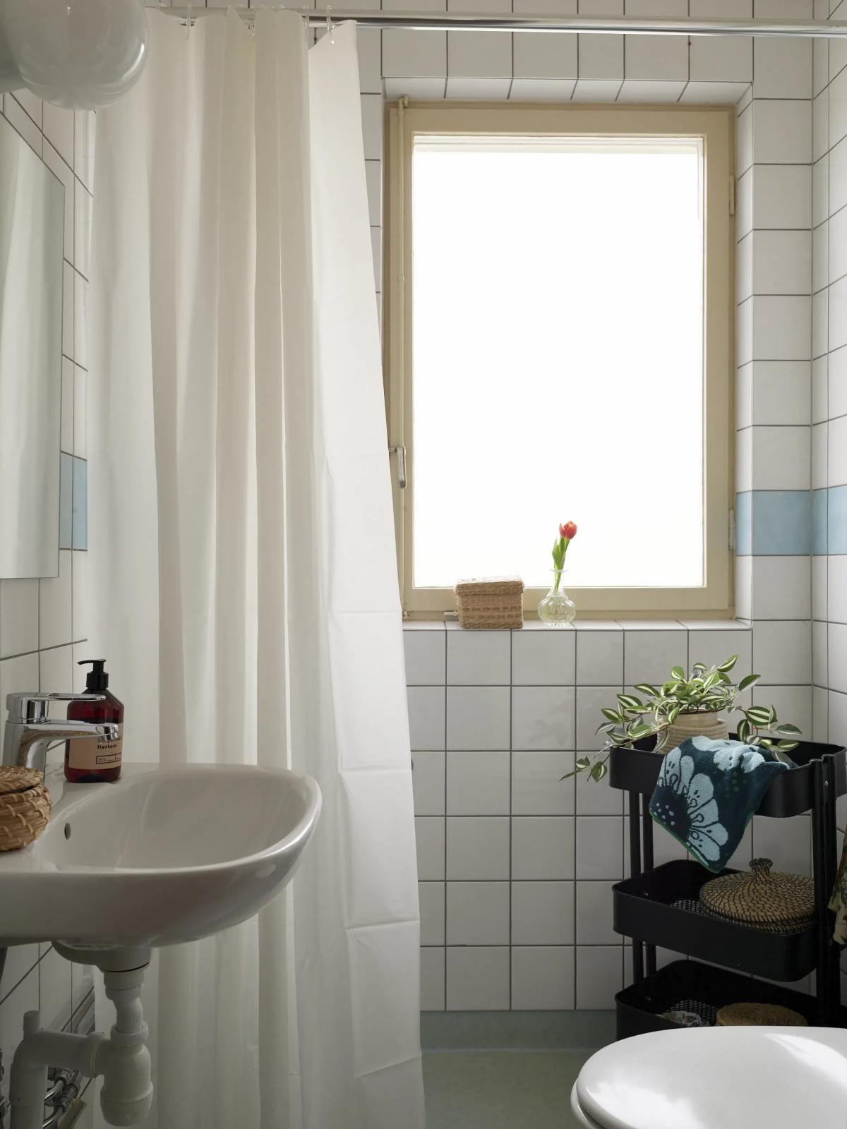
But there are no surprises in the bathroom. An open shower behind a curtain and no washing machine.
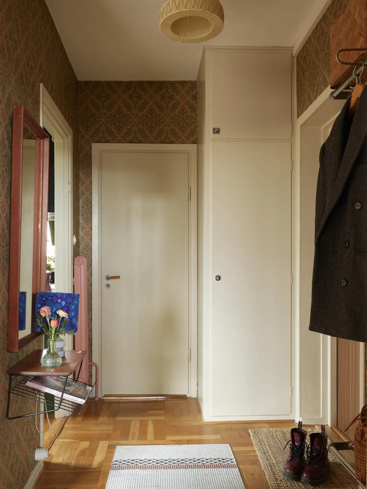
That concludes our tour. What do you think of the apartment? Share your impressions 🙂 Could you live in such a retro place? Or do you prefer a more modern renovation?


